Introducing the Enhanced User Interface (UI 4.0) of the Qualys Enterprise TruRisk™ Platform

Qualys is excited to announce the rollout of our Enhanced User Interface (UI 4.0)—an exciting milestone in improving your platform experience. These updates are the result of careful analysis and collaboration with our Product Advisory Board, customers, and insights from conferences and ongoing research. This new interface is designed to make your Qualys journey faster, smoother, and more immersive.
The UI 4.0 redesign is built to empower you with:
- Faster navigation – Simplified workflows save time and effort.
- Improved efficiency – Dynamic navigation and intuitive components reduce task completion time.
- Increased productivity – Streamlined interactions and modernized design improve overall efficiency.
- Improved accessibility – Designed with inclusivity in mind, offering enhanced support for visually impaired users.
- Accessibility for all users – Optimized contrast ratios and font sizes ensure a seamless experience for everyone.
- Effortless data consumption – Clear, visually appealing layouts make insights easier to interpret.
- Modern and intuitive design – A cohesive and polished interface elevates your overall platform experience.
- Seamless interaction – Redesigned elements provide a smoother, distraction-free experience.
- Enhanced aesthetic appeal – A visually appealing design makes your time on the platform enjoyable.
- Reduced cognitive load – Categorized and filtered information helps users focus on what’s most relevant.
- Timely actions – Clear separation of actionable items and general updates ensures effective prioritization.
- Improved clarity – The updated layout helps users understand their exact location within their workflow.
- Simplified decision-making – Fewer upfront navigation options reduce complexity, enabling quicker decisions.
- Optimized for all users – Whether onboarding or a power user, enhancements ensure a smoother navigation experience.
Here’s everything you need to know about the upcoming changes.
What’s New in UI 4.0?

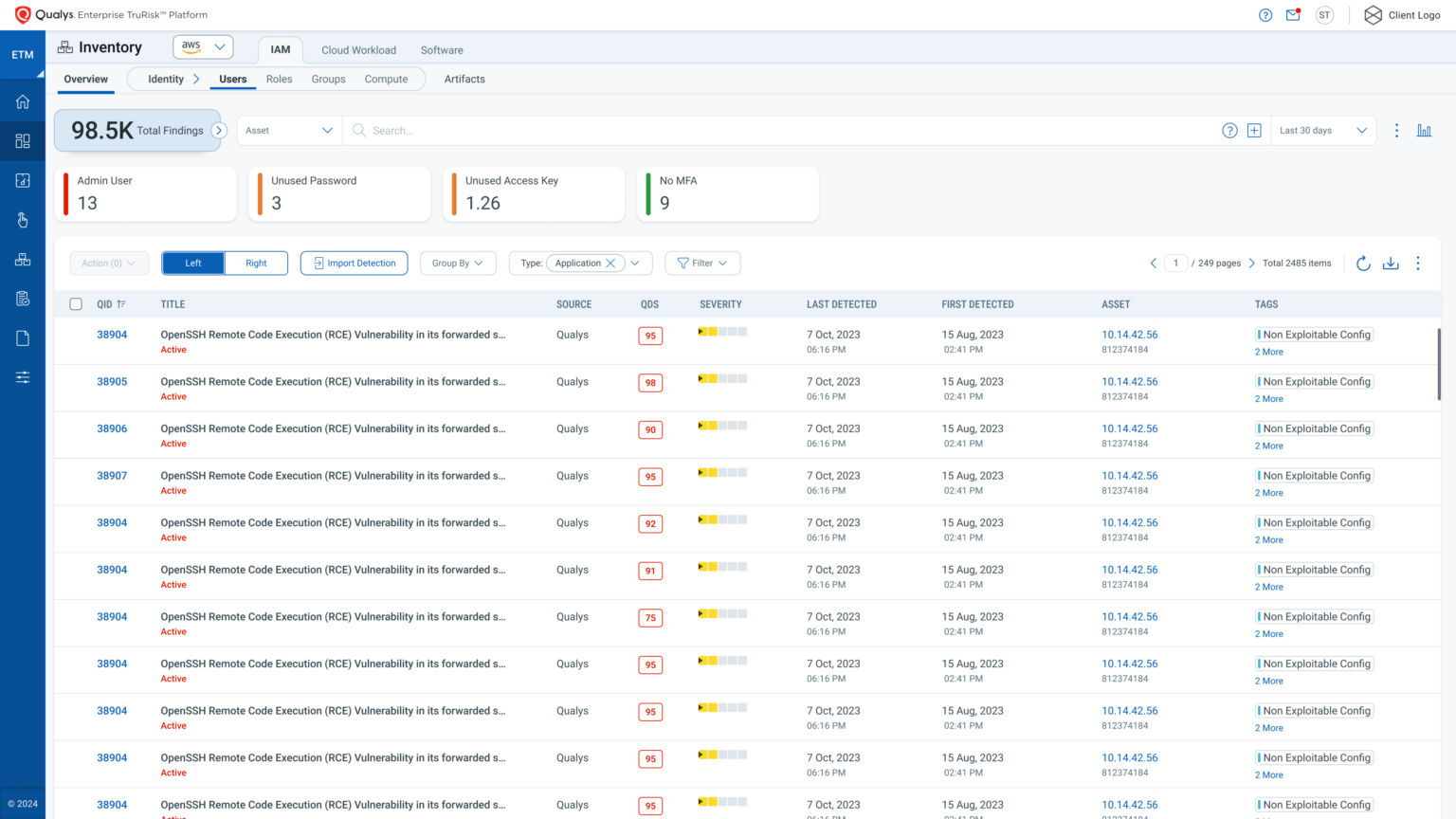
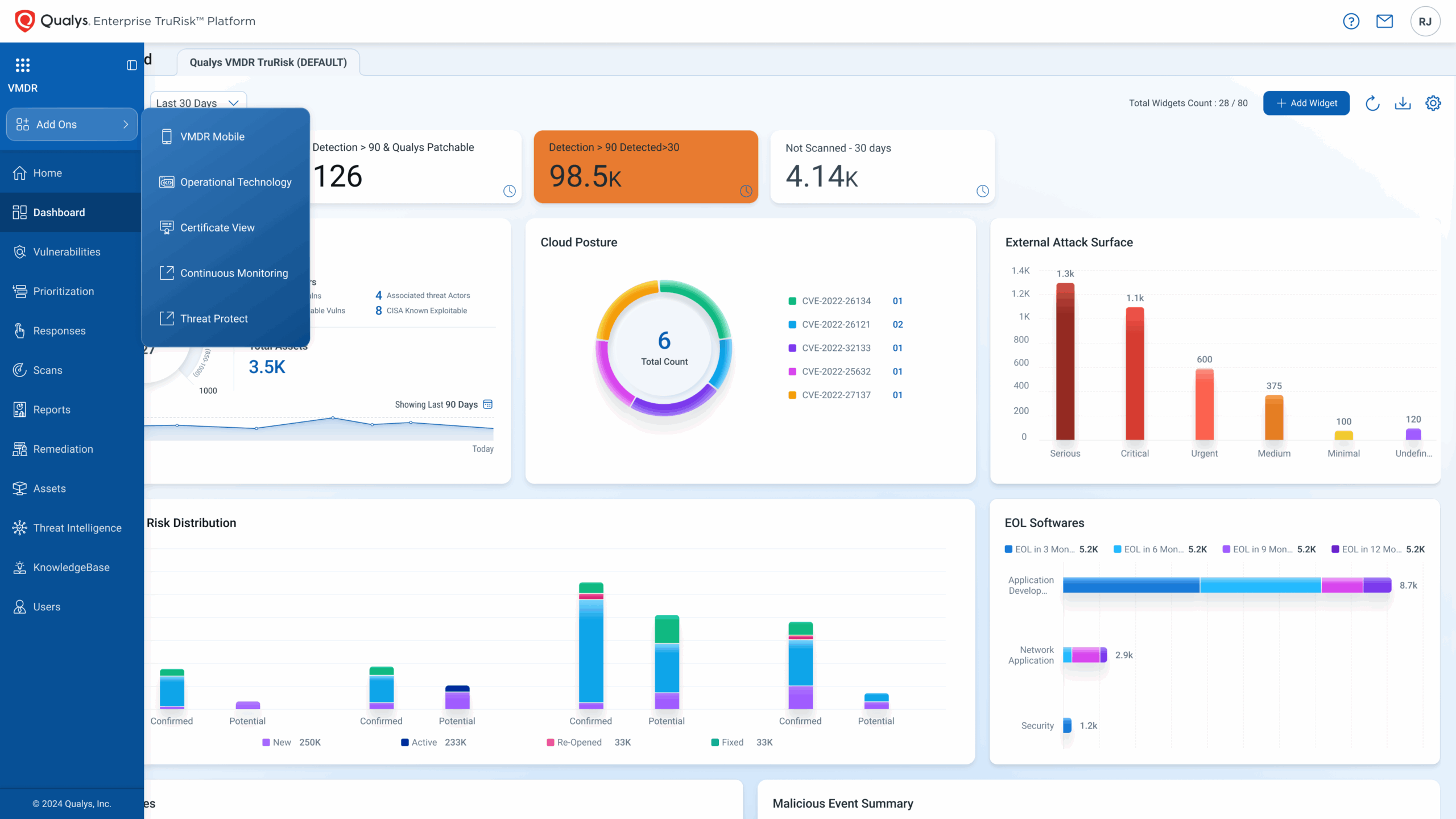
1. Improved Platform Navigation
In line with Hick’s Law—which states that decision-making time increases with the number and complexity of options—we’ve redesigned the platform navigation to make it more intuitive and user-friendly. This new layout reduces cognitive load, providing a clearer distinction between primary, secondary, and tertiary navigation elements, ensuring a seamless workflow for both new and experienced users.
Primary Navigation
- Vertical Navigation Bar: The left-hand side now features a vertical primary navigation bar for quick access to key modules and features.
- Initially collapsed, it displays a stack of icons for a compact view.
- On hover, it dynamically expands to show both icons and their corresponding labels.
- A groove effect with a dark blue background highlights the currently active feature (e.g., “Dashboard”).

- Docking/Undocking Option: A toggle icon, located next to the current module name in the top-left corner, allows users to dock or undock the navigation bar. This is particularly helpful for those who prefer to see icon labels at all times.
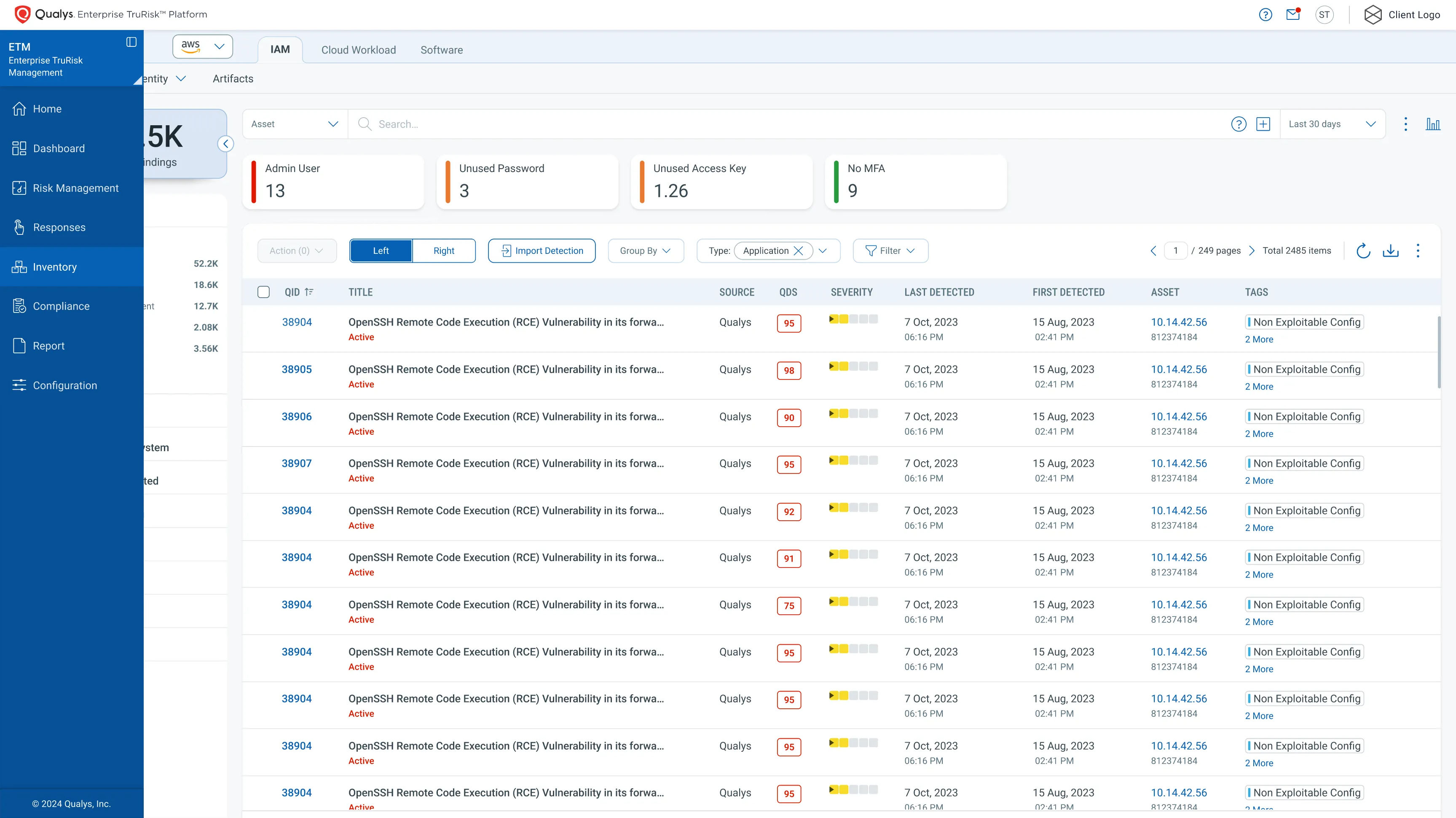
- Aligned Updates: Modules like Scans, Reports, Remediation, Assets, Threat Intelligence, Knowledgebase, and Users within the VMDR module have been fully updated. These updates also apply to the User Profile, Notifications, and Help sections, providing a consistent user experience for legacy VM module users.
Secondary Navigation
- Horizontal Navigation Bar: Sub-menu options are now presented in a crisp horizontal secondary navigation bar at the top of the screen.
- Clear Indicators: The active tab is highlighted with bold text within a box for easy identification.
- Dynamic Sub-Levels: When tertiary navigation is required, the options appear below the secondary bar. Fourth-level navigation elements are displayed as capsules, with the selected item underscored for clarity.
Enhanced Navigation Features
- Collapsible Widgets: Facet with Count widgets and collapsible options enhance efficiency, allowing users to focus on relevant content.
- Progress Indicators: Multi-step wizards now include visual progress indicators, ensuring clarity throughout longer workflows.

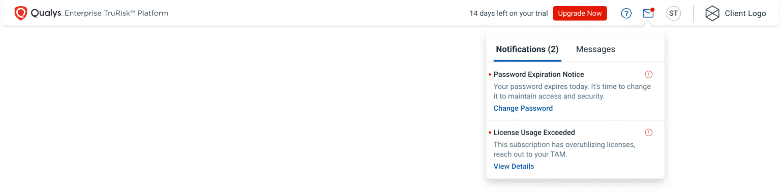
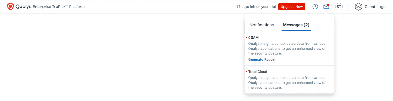
2. Communication Refinements
Effective and clear communication is essential for a seamless user experience. To achieve this, we’ve redesigned the Communication tab (accessible via the Envelope icon) by applying the chunking principle, which organizes information into manageable sections. Notifications Section – This section focuses on items that require your immediate attention and follow-up, such as:
- Required password changes.
- Upcoming expiration of ongoing module trials.
- Exceeding your allotted license capacity.
Messages Section – This section delivers general updates and information from the platform, such as:
- Notifications when scheduled vulnerability scanning reports are ready.
- Announcements about platform changes or updates.
3. Updated UI Components
The refreshed Qualys UI introduces updated components and dialogs designed to enhance usability, aesthetics, and seamless interactions. These improvements are tailored to boost your efficiency and elevate your overall platform experience.
- Refreshed Input Fields – Enhanced forms for Search, Date, Email, Text, and Text Area inputs.
- Updated User Selection Tools – Improved components such as Combo Box, Multi-Select Combo Box, Checkboxes, Radio Buttons, Dropdown Menus
- Restructured Modal Dialogs – Redesigned dialogs that minimize interruptions, allowing you to focus on tasks efficiently.
- Refined Overlay Screens – Enhanced overlay designs for Single-pane, two-pane, and three-pane views. These updates make the screens more intuitive, ensuring a distraction-free and seamless interaction with content.

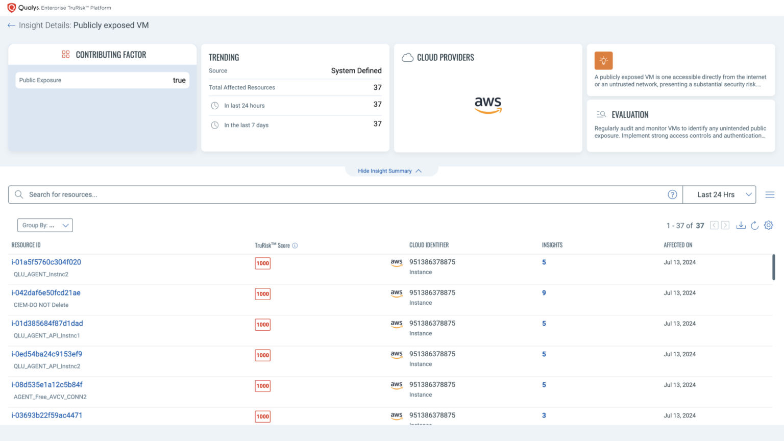
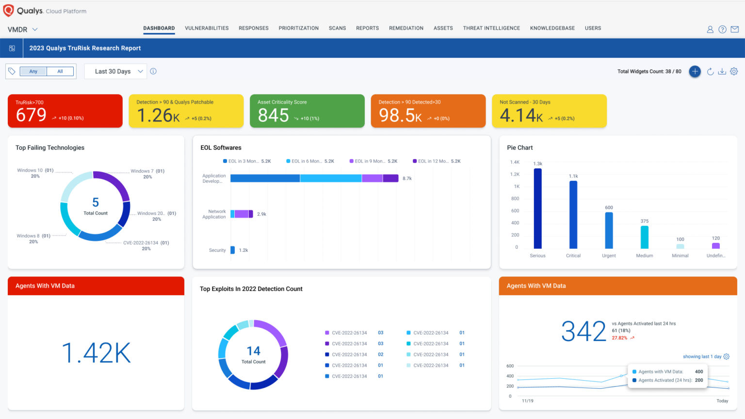
4. Refreshed Dashboards
The newly refreshed dashboard brings a modernized experience that is intuitive, accessible, and visually appealing. These updates ensure effortless information consumption and cater to all users, including those with visual impairments.
- Improved Accessibility – Optimized contrast ratios between text and background colors and adjusted font sizes for better readability, particularly for visually impaired users.
- Enhanced Usability – Simplified layouts and intuitive designs streamline your workflow.
- New Look and Feel for Cards – Updated card designs improve clarity and visual organization.
- Refined Color Scheme – A polished palette ensures consistency and reduces visual strain.
- Better Chart Legends – Redesigned chart legends with improved layouts for easier interpretation of data.
5. New Module Picker: A Single Pane of Glass
The new Module Picker transforms navigation into a cohesive and intuitive experience:
- Holistic View: Quickly access all active subscriptions, ongoing trials, and discover new features under the Applications tab.
- Simplified Organization: Modules are grouped under product families, leveraging Miller’s Law to reduce cognitive load and make navigation faster.
- Quick Access: Access the Module Picker with a simple mouse click on the top-left corner, displaying the current module name (e.g., VMDR).
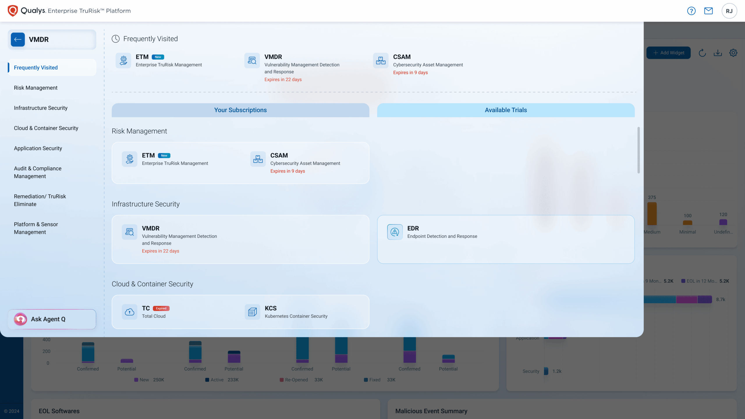
New Module Picker will be available by the end of June, 2025.
See It in Action
Watch the video with a walkthrough of the new UI showcasing key enhancements.
Rollout timeline and how to plan your transition
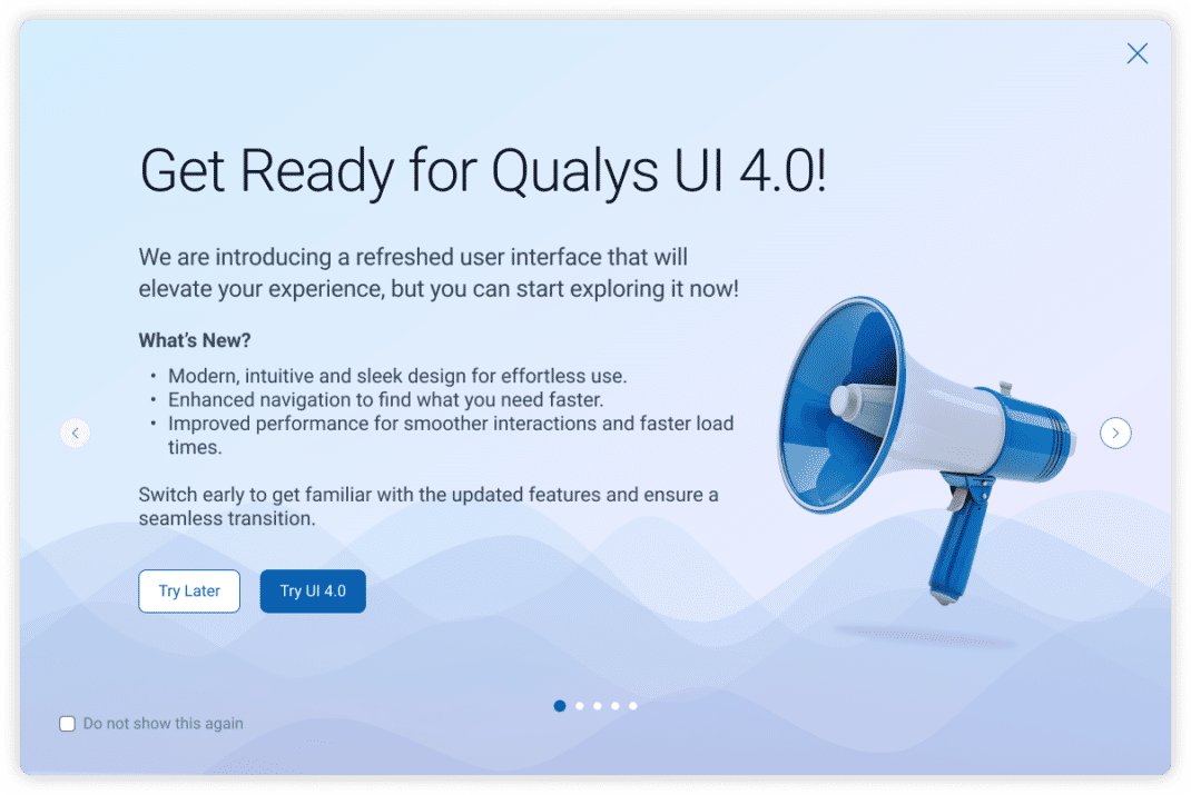
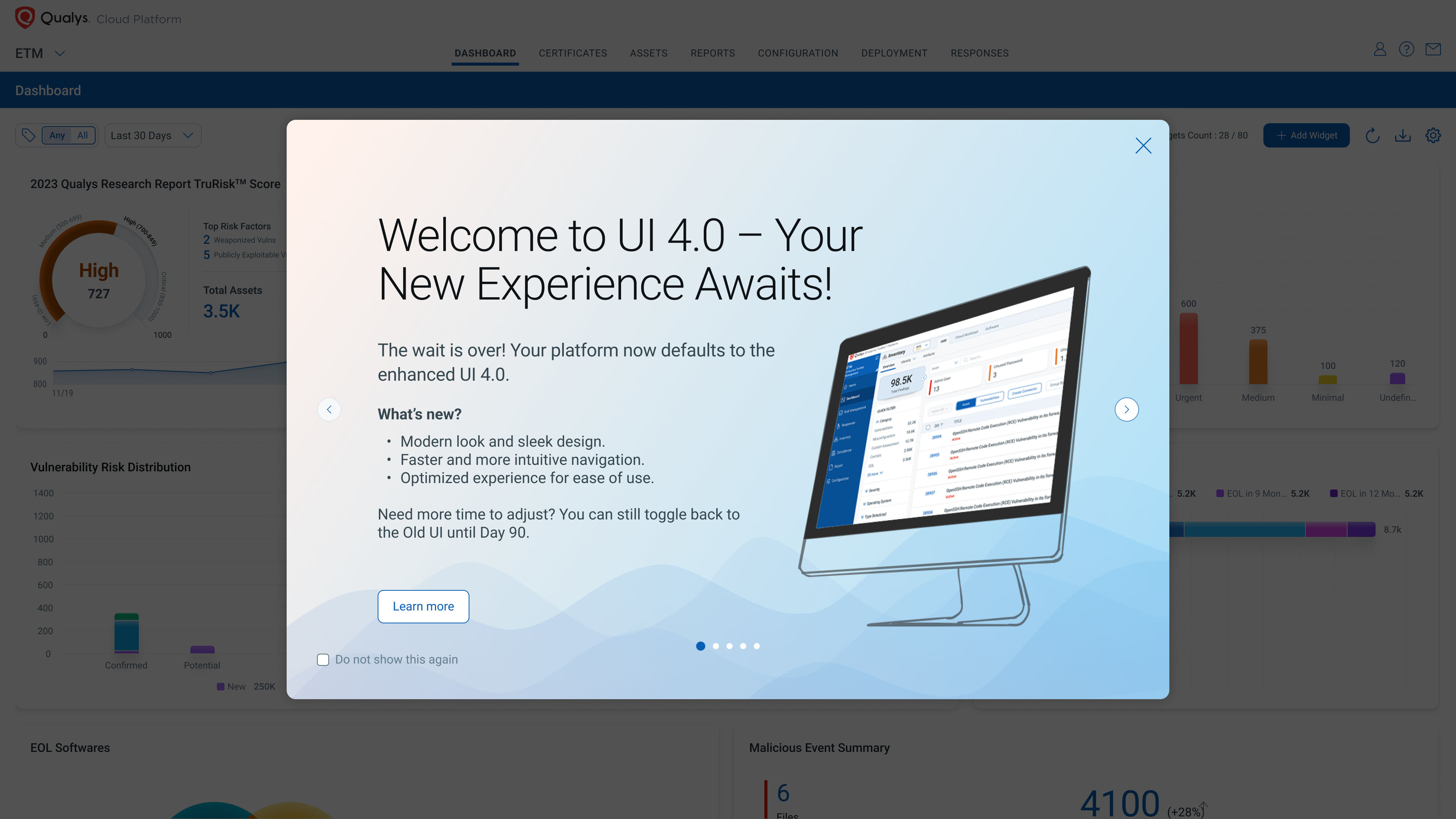
The Enhanced UI will begin rolling out in January 2025. You’ll receive in-platform notifications and email updates to keep you informed about the transition.
| Phase | Phase 1: Switching option to UI 4.0 | Phase 2: Automatic UI 4.0 Upgrade with Rollback Option | Phase 3: Mandatory UI 4.0 Upgrade |
| Duration | Day 1 to Day 30 | Day 31 to Day 90 | Starting Day 91 |
| What to Expect | New UI becomes available for exploration. Users can toggle between Old UI and New UI. Login prompts encourage switching to the New UI. | Platform defaults to the New UI. Users can still revert to the Old UI using the toggle button. In-platform notifications continue to provide reminders. | Old UI is fully phased out. The toggle button to revert is no longer available. All users will be on the New UI permanently. |
| Key Action | Familiarize yourself with the New UI and provide feedback. Option to skip UI 4.0 prompts. | Use this period to complete your transition. | Contact your Technical Account Manager (TAM) regarding any help required. |
Frequently Asked Questions
We’ve compiled a list of frequently asked questions to make your transition smooth and stress-free.
Q1: When will I know once the New UI is available?
A1: The New UI will be rolled out globally in phases.
Once it’s available on your platform:
- A banner will appear after you log in, prompting you to switch to the New UI.
- You’ll also receive a notification under the envelope icon in the interface.
Q2: How will I be notified about the upcoming changes to the UI?
A2: Notifications about the New UI transition will be delivered through multiple channels:
- In-platform notifications: Banners on the login page and announcements in the platform.
- Email updates: Phase-wise email updates sent to registered users.
- Blogs and Customer Support Portal: Additional context and reminders.
- Status Page: You will be notified if you have subscribed to updates on https://status.qualys.com/
Q3: Can I continue using the existing UI for a few more weeks while I get comfortable with the new one?
A3: Yes, during the initial transition phase, you can switch back to the Old UI using the “Switch to Old UI” option under the Help menu. This option is available for up to 90 days after the New UI becomes available.
Q4: How long will the platform continue to display the Old UI?
A4: The Old UI will remain available for 90 days after the New UI becomes available:
- Days 1–30: Both the Old and New UI will be available.
- Days 31–90: The New UI becomes the default interface, but you can still toggle back to the Old UI.
After Day 90, the Old UI will no longer be available.
Q5: When will the platform show the New UI by default?
A5: Starting on Day 31 after the New UI becomes available; the platform will display the New UI by default.
However, if needed, you can toggle back to the Old UI until the end of the 90-day transition period.
Q6: When will the Old UI be completely phased out?
A6: 90 days after the New UI’s availability, the Old UI will no longer be accessible and will be fully phased out effective Day 91.
From this point onward:
- The New UI will be the only available interface.
- The toggle option to revert to the Old UI will no longer be provided.
Q7: How will my UI preference be managed?
A7: The platform stores your UI preference (Old UI or New UI) on the backend and your selected UI preference will be retained across sessions, ensuring a consistent experience. You can update your preference by switching between the Old and New UI using the toggle option until Day 90.
If no preference is set, the platform will default to the New UI after the 30 days transition period.
If you encounter any issues with UI preferences, please reach out to your Technical Account Manager (TAM) or Qualys Support for assistance.
Q8: I see a prompt every time I log in. How can I turn it off?
A8: To stop seeing the login prompt for switching to the New UI, select the “Do Not Show This Message Again” checkbox on the banner.
Q9: I no longer see a banner prompting me to upgrade to UI 4.0. How can I switch?
A9: If the banner is no longer visible, you can still switch to the New UI (UI 4.0) manually by using the toggle button located above the menu bar till Day 30 and the toggle option under “Help” menu starting Day 31 and onwards.
Q10: Is there any loss in functionality for any existing workflow?
A10: No, there is no loss in functionality. The New UI has been designed to enhance your user experience without compromising existing workflows. All current features and capabilities will remain intact, ensuring a seamless transition. The New UI introduces improvements in navigation, performance, and usability, but the underlying functionality of the platform remains the same. If you encounter any issues or have concerns about specific workflows, please reach out to your Technical Account Manager (TAM) or Qualys Support for assistance.
Your Feedback Matters
Your input has shaped this update, and it continues to guide us.
If you have questions or need assistance, contact your Technical Account Manager (TAM) or Qualys Support.
This is looking REALLY slick. I’m impressed. Can’t wait to use it!!
I can’t select the ‘Don’t show this message again’ checkbox on the banner in the mobile version of the browser on iPhone.